


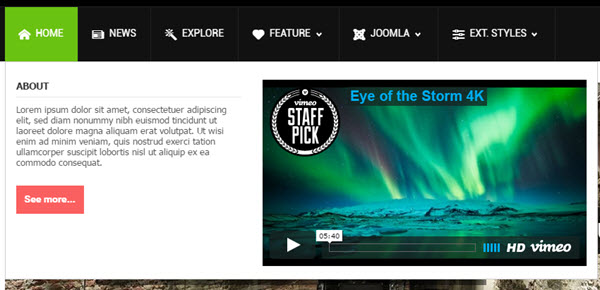
On the top of this page, you can see live demonstration of Main Menu with icons and rich text.
Main Menu is very powerful menu built with clean accessible XHTML code structure and effective drop-down submenu panels.
Main Menu Icons
You can attach any of many icons to menu items to make them more appealing.
Main Menu Rich Text
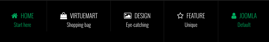
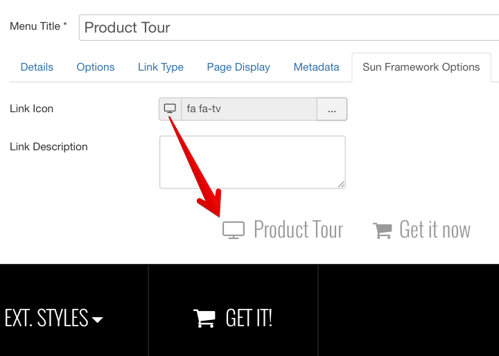
You can add descriptive text to menu items to make them much clearer.
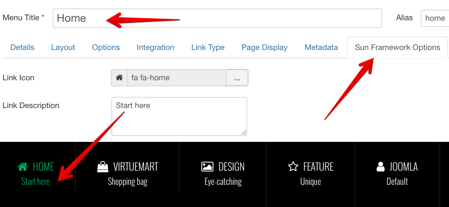
To set up descriptive text, you need to go to menu item settings and add descriptive text to menu items parameter Link Description.
Main Menu Icons and Rich Text in combination
You can set up menu items to utilize both icons and rich text in combination. Take a look at main menu on this page to see live demonstration.
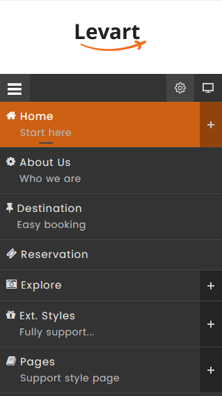
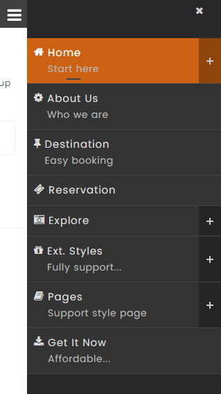
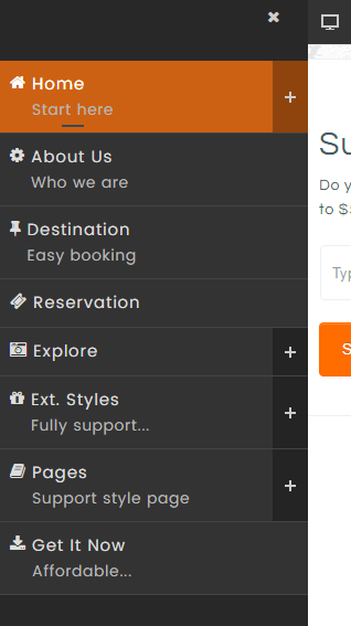
Here you can see live demonstration of Side Menu with icons and rich text.
Side Menu is very unique vertical menu with slide-out panels. This menu is extremely efficient when you have complex navigation with a lot of menu items.
To setup Side Menu you just need to configure module parameter “Menu Class Suffix” appropriately and the menu system will take care of the rest. There are very detailed instructions in template documentation.
Side Menu with Icons and Rich Text
Side Menu can present menu items with icons and descriptive text, pretty much like Main Menu.
To setup icons you need to configure menu items appropriately just like Main Menu. There are very detailed instructions in template documentation.
Here you can see live demonstration of Tree Menu.
Tree Menu represents menu items in clear tree-like hierarchy, which is very appropriate for indexing menu. By default all submenu items are collapsed until you select the parent menu item.
To setup Tree Menu you just need to configure module parameter “Menu Class Suffix” appropriately and the menu system will take care of the rest.
Tree Menu with Icons and Rich Text
Here you can see live demonstration of Tree Menu with icons and rich text.
Tree Menu can present menu items with icons and descriptive text, pretty much like Main Menu and Side Menu.
To setup icons you need to configure menu items appropriately just like Main Menu. There are very detailed instructions in template documentation.
Lorem ipsum
Lorem ipsum dolor sit amet, consectetur adipiscing elit. Cras non lorem libero. Vestibulum a leo ac tortor congue euismod. Nam sed nulla tellus. Suspendisse ut hendrerit justo. Sed molestie vestibulum nisl, a sodales urna molestie nec. Etiam neque nisl, malesuada ut egestas ut, facilisis vel leo. Morbi gravida blandit porttitor. Phasellus sed diam ante, quis lobortis tortor. Nunc quis mi congue ipsum fringilla hendrerit nec eget magna.
Lorem ipsum
Quisque sed mi non risus egestas cursus. Aenean odio mi, rhoncus sit amet tincidunt placerat, pellentesque ac mi. Mauris est lectus, faucibus vel ultrices eget, lobortis vitae lorem. Nam non nisl vel lorem pulvinar pharetra quis nec augue. Sed in odio lorem. In hac habitasse platea dictumst. Pellentesque elementum, ipsum vel sollicitudin porttitor, felis augue pharetra erat, ut vestibulum dui turpis sed nulla. Suspendisse ac nulla nisi. Fusce sed est a leo gravida bibendum non non odio. Maecenas et tortor sit amet dolor sagittis scelerisque sed sit amet lectus. Suspendisse sollicitudin suscipit velit, eu pellentesque tortor tristique a. Aliquam ut velit dolor, quis convallis orci. Curabitur tincidunt aliquam tellus id tempor. Etiam iaculis erat id metus placerat eget lacinia est eleifend. Ut in interdum mi.
All JoomlaShine templates come with a responsive design to make sure that your website will look beautiful not only on all major web browsers but also on mobile devices.
We also offer a mobile version of the main menu to enhance the mobile user experience. There are 4 types of mobile menu to choose simply by a few clicks via administrator:
Sticky Mobile Menu
Sticky mobile menu allows your users landing on your site using a mobile device easily access to your menu from anywhere on the website, without having to scroll back to the top of the page. By default, sticky menu is automatically enabled for both mobile and desktop devices in Menu & Site Tools section.

Default Mobile Menu
This is the default mobile menu style showing the menu in full-width form under the toolbar.
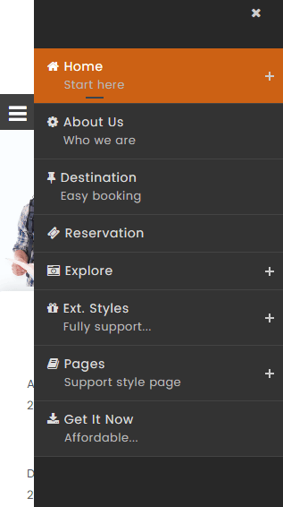
Mobile Menu with Push Effect
The mobile menu will appear from the left/right while website content will be pushed to the same direction.
Push Right
Push Left
Mobile Menu with Slide Effect
The mobile menu will slide in from the left/right and overlap website content.
Slide Right
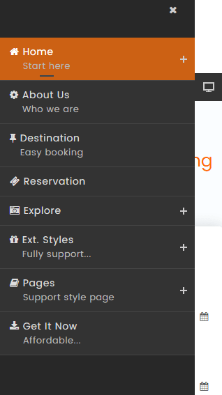
Slide Left
Mega menu is a perfect choice for creating unique large menus since it has been a new and growing web design trend lately. Regular drop-down menus only show text alone or text and icons vertically in a single column. However, mega menus are able to show all the options in one large panel, so visitors can easily reach most pages no matter where they are.
All JSN templates allow you to create a mega menu for site navigation and usability enhancement. They provide a visual way to create a mega menu with clicks and drag-n-drop function, without touching a single line of code.
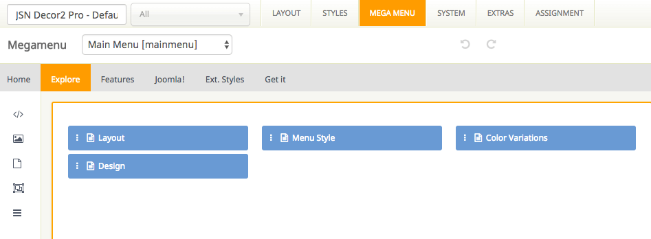
Support multiple types of content
Our Megamenu allows you to display a lot of content in menu item such as text, images and videos in multiple columns. You can choose one of 3 element types including Joomla module, Submenu and Position to present your content in Megamenu.
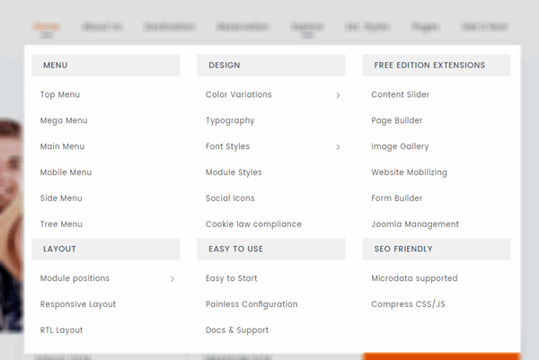
Easy to use
With JSN templates, all settings can be done via template parameters in the section Megamenu. You can find it easy to build the skeleton and add elements to make the content of mega menu based upon your need with no coding skills required.
At the top of this page, you can see live demonstration of Top Menu.
Top Menu allows you to arrange menu items in horizontal line and assign icons to them. All icons are configured directly in menu item settings page which is very convenient.
You can choose up to 28 predefined icons to menu item.
